Less is More: The Best Simple Wedding Invitations
sofia sayer
Simplicity
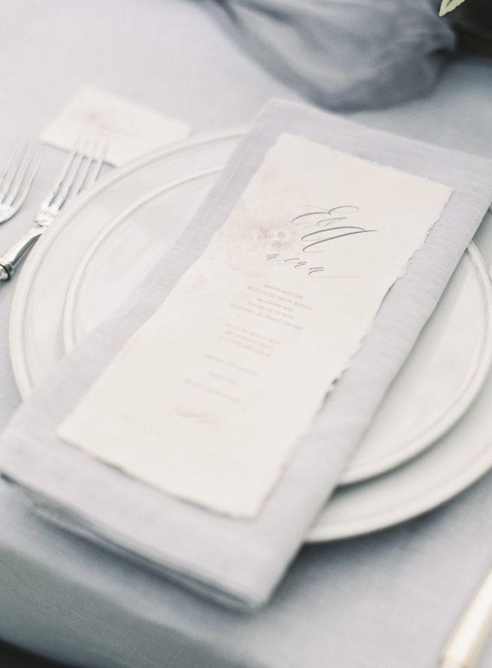
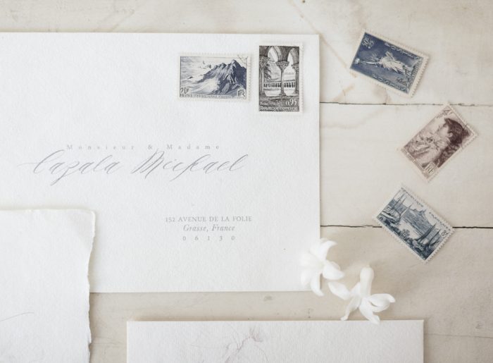
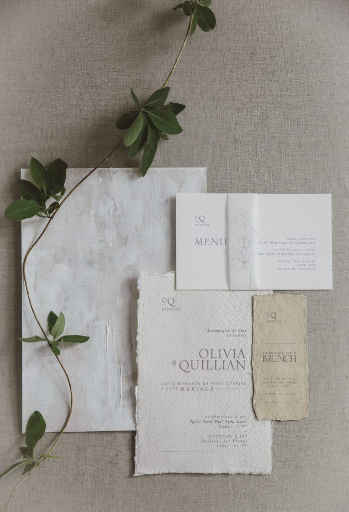
Simplicity is one of the founding and never failing rules in the design world. It is encouraged in graphic design, photography, interior design, painting, drawing, really any aspect of art or functionality. But as a wedding designer, it ends up being harder to keep invitation design really simple. There are so many fun ways to add in cute and eye catching elements so it is easy to go overboard sometimes. As brides scroll through Pinterest they are bombarded with a abundance of patterned envelope liners, floral arrangements, ribbons, belly bands, foil, vellum and your brain is over stimulated and overwhelmed. Although all those elements can be beautiful and elegant, sometimes the best way to get there is through a more simple design.
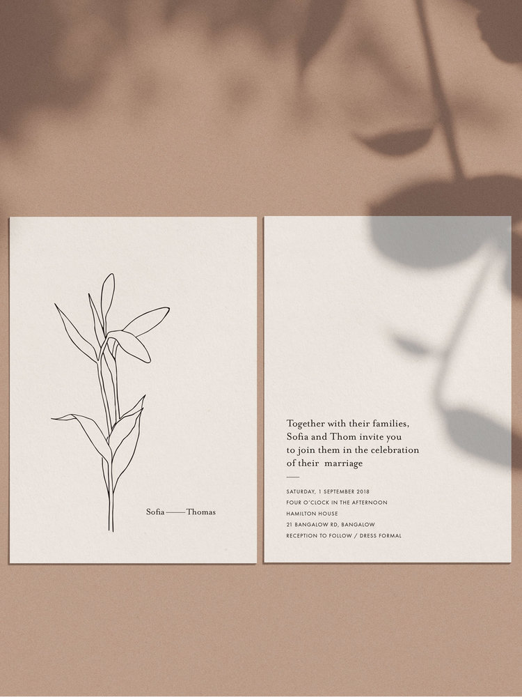
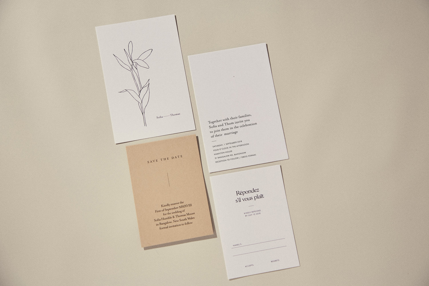
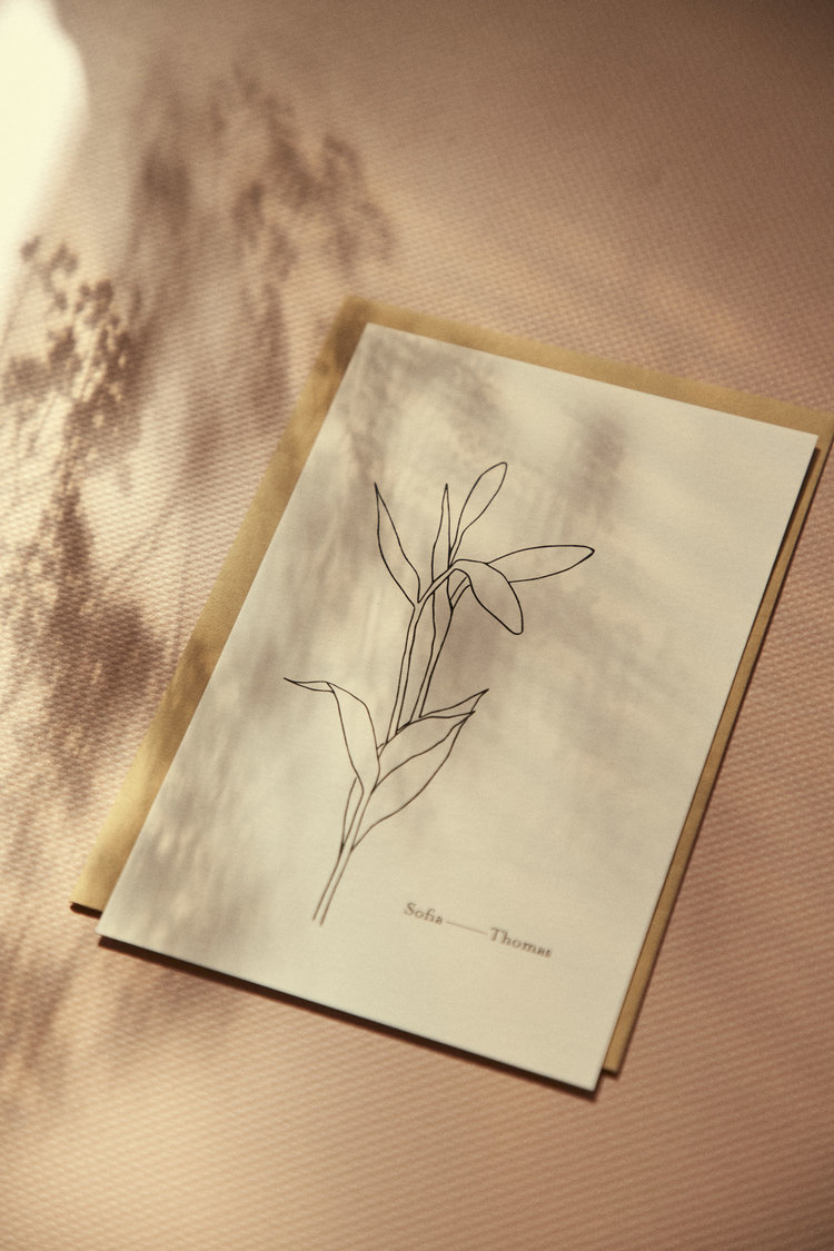
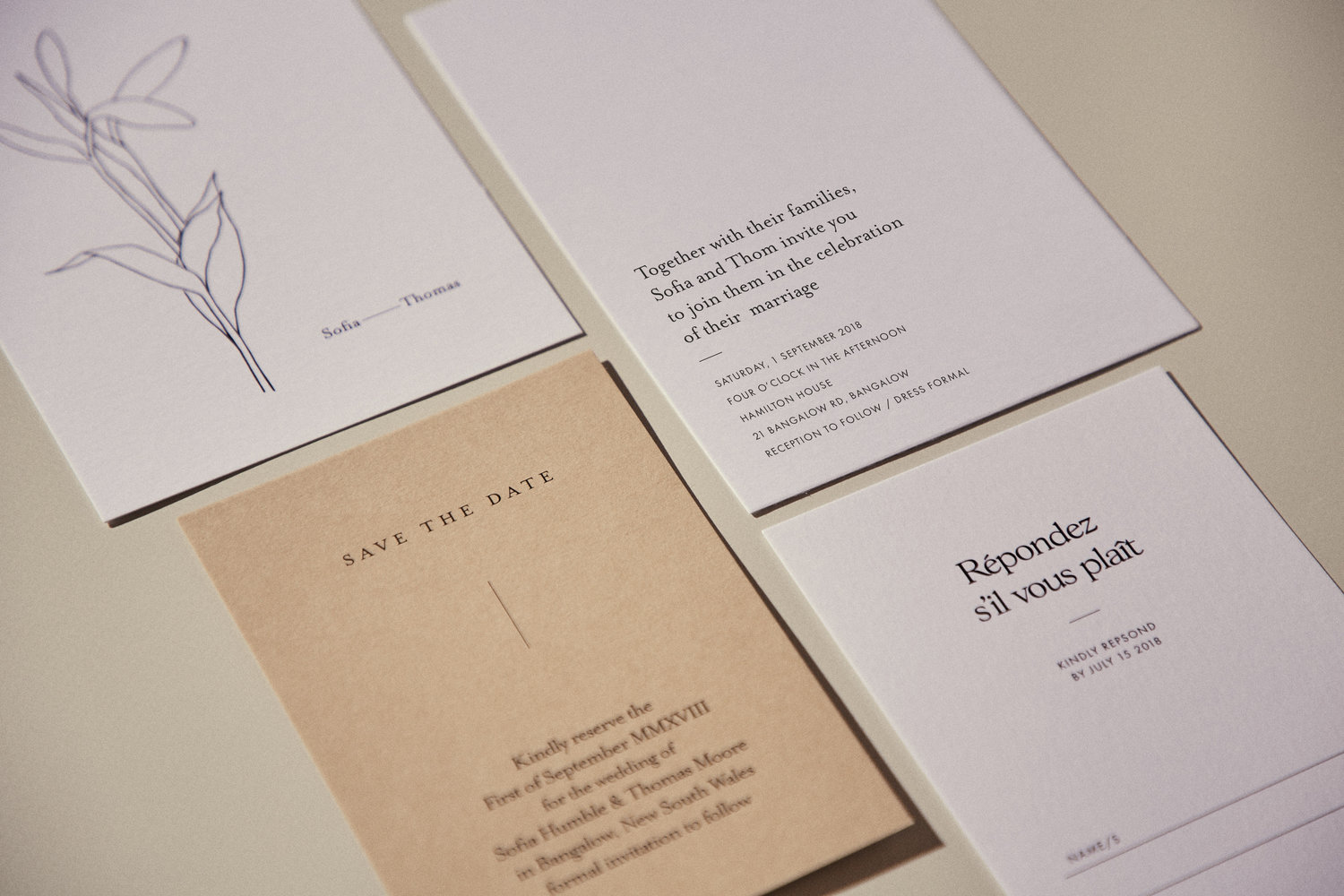
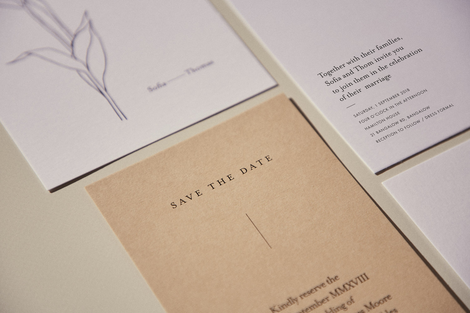
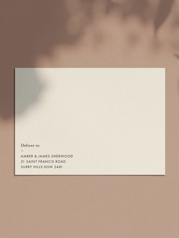
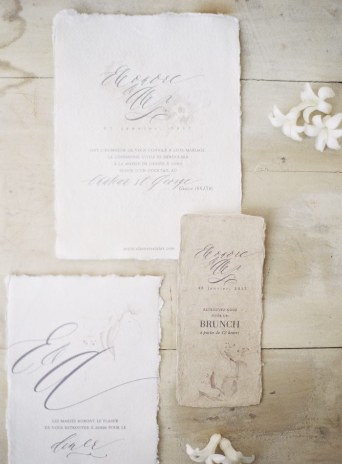
Check out this beautiful French invitation that embrace simplicity. This invite is called “Fleur 1” and was a collaboration with an artist in Paris named, Laura Horrocks by the PAPER/PAPER company. Beautiful work!
Acrylic Vellum Invitation
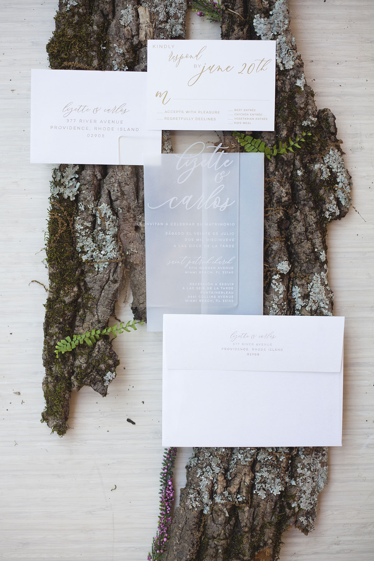
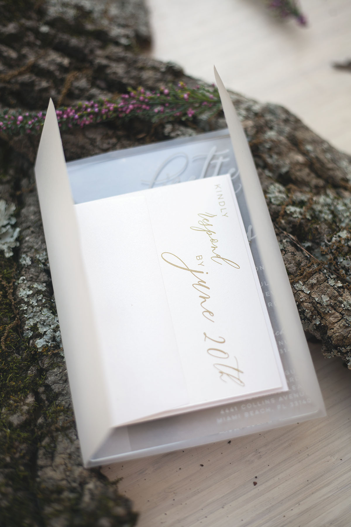
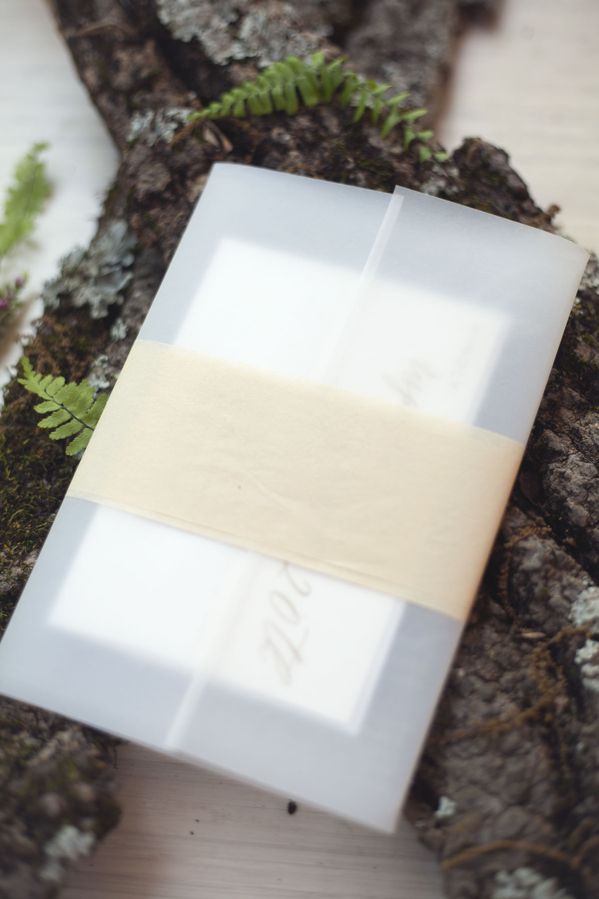
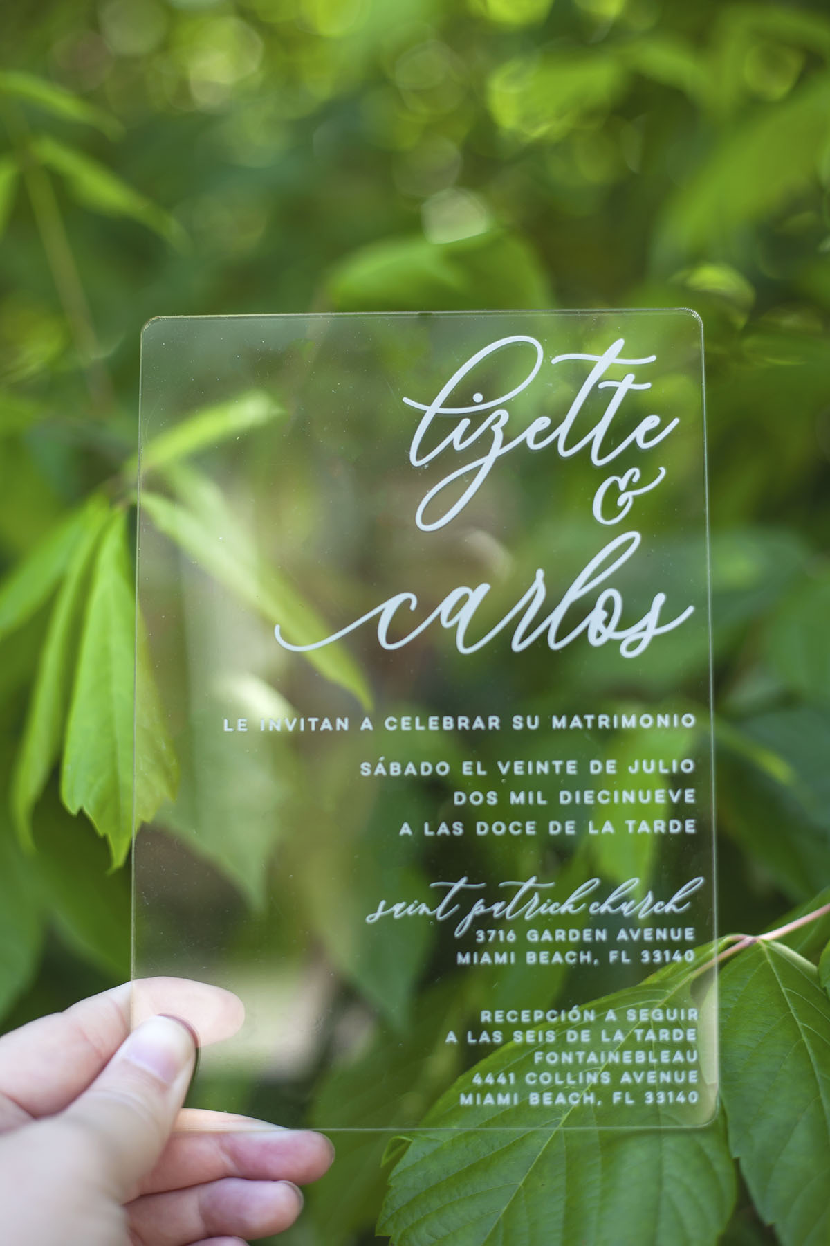
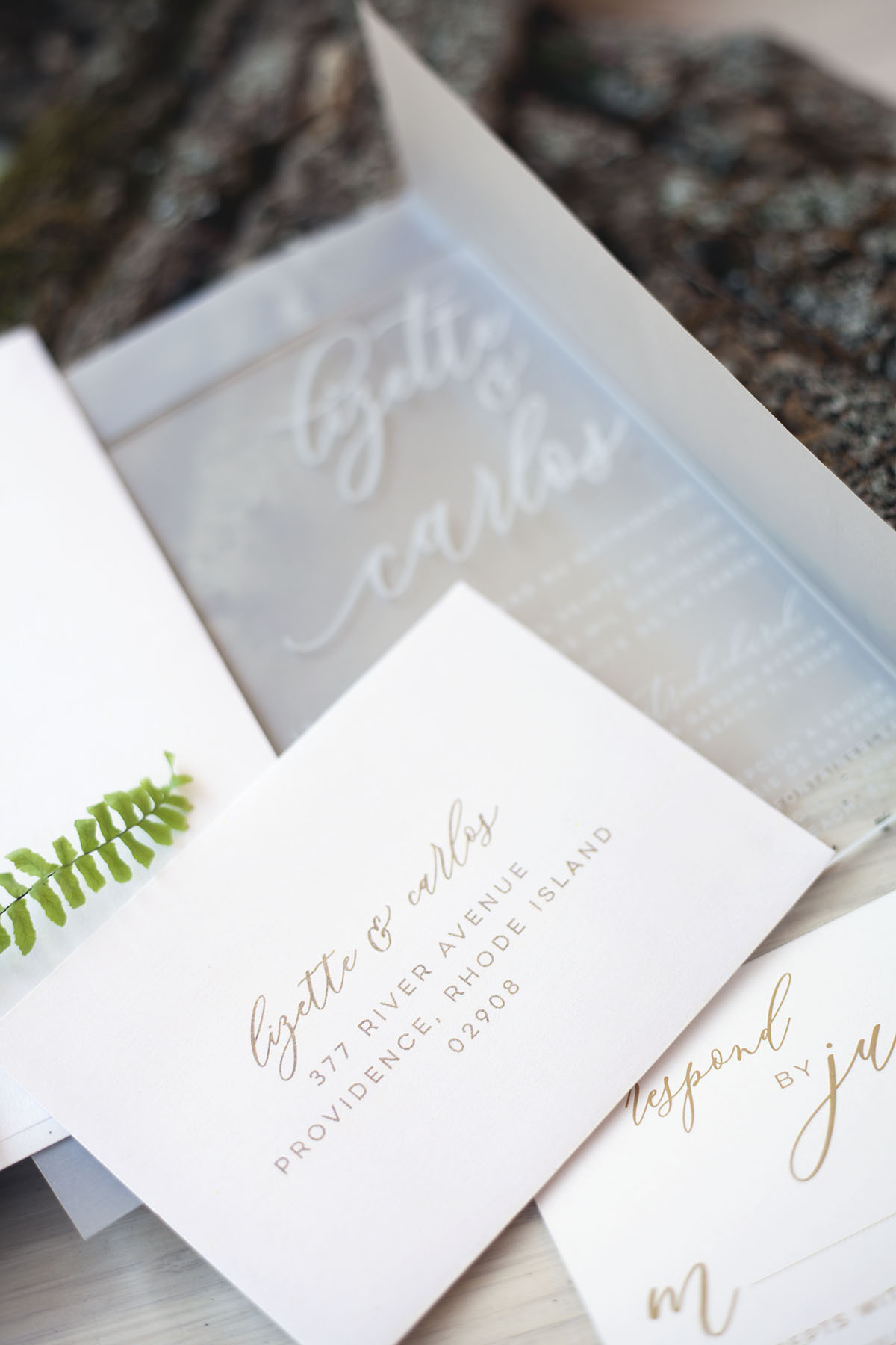
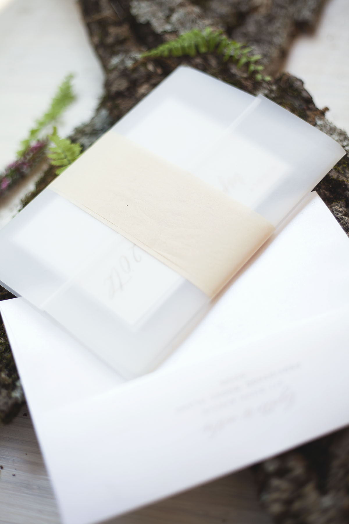
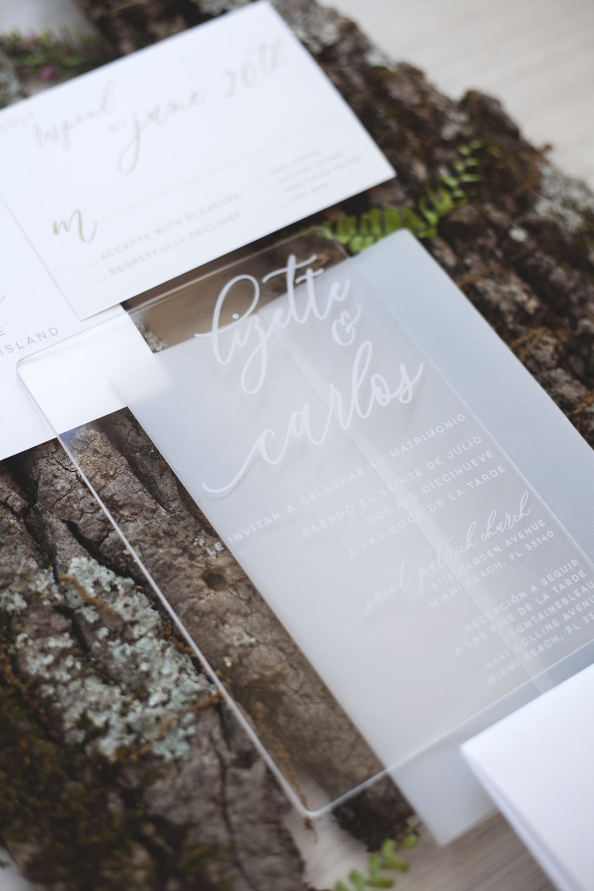
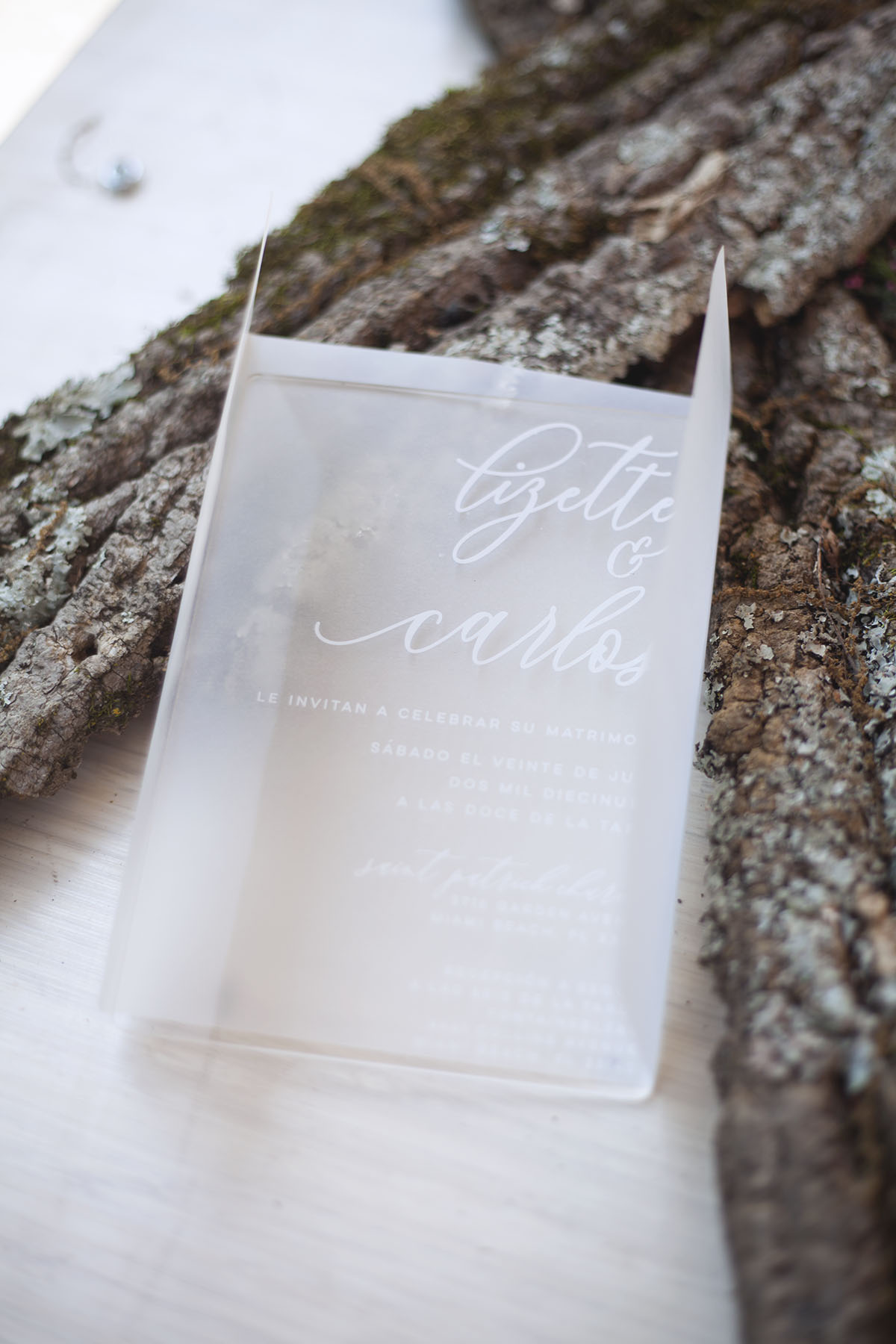
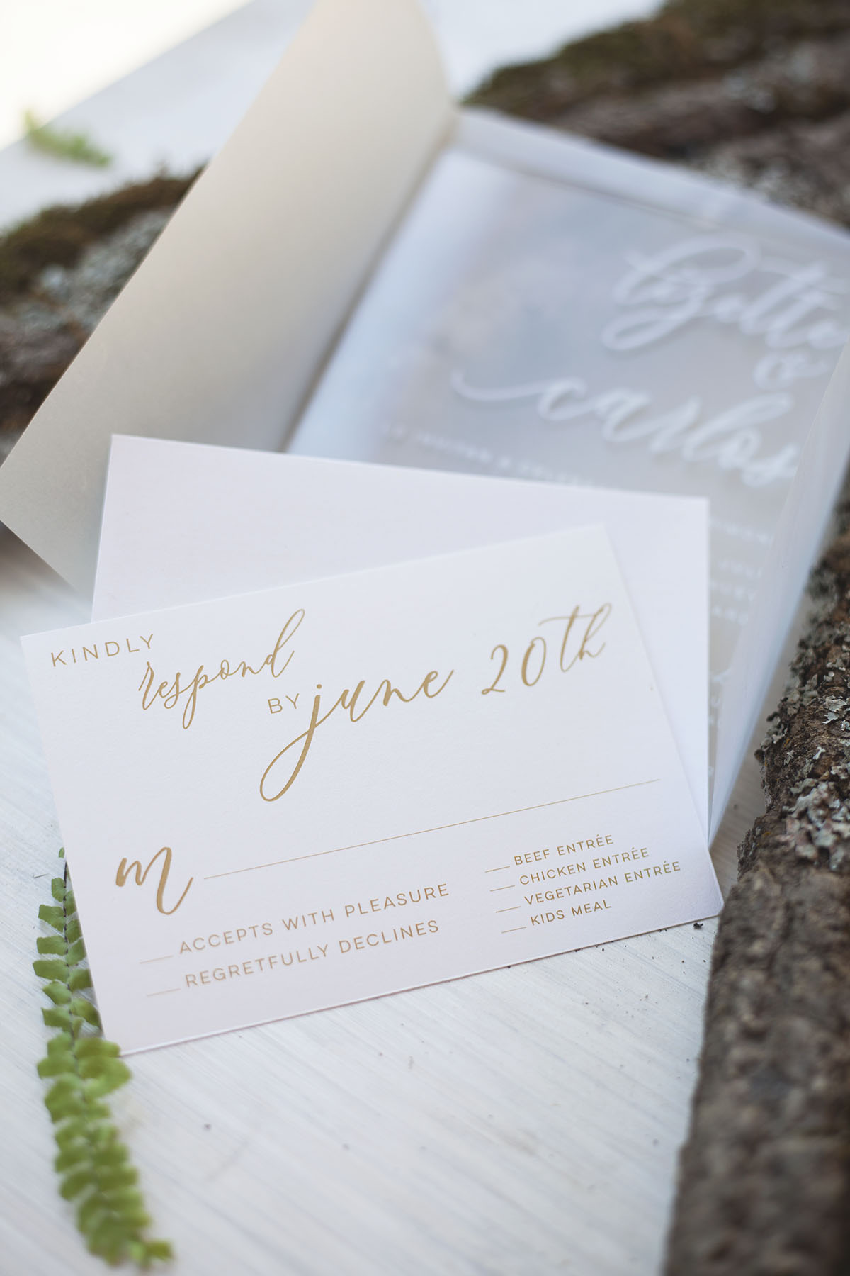
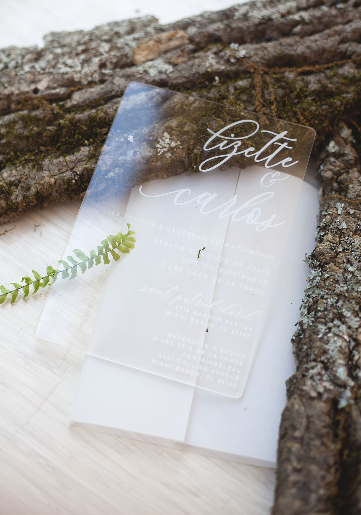
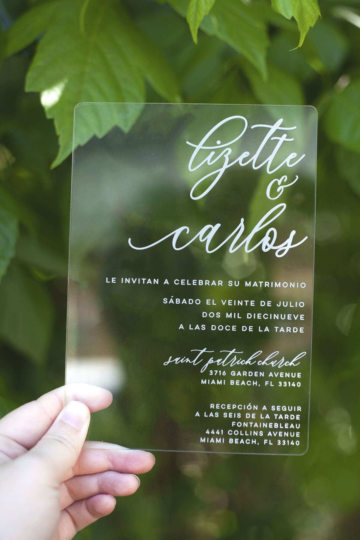
Here are the acrylic invitations that I had more of a challenge with because just how simple the bride wanted it. The RSVP and envelopes are digitally printed gold with a plane vellum wrap and neutral tissue paper wrap. The acrylic invitation were done in both Spanish and English for her guest. I think they turned out very elegant despite my urge to add more colors and design elements!
Here is another beautiful example of a simple design by the design studio, Graphikkart. This font is more dramatic but the colors and other design elements keep it elegant and natural.
